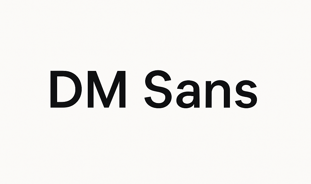
New product font

For us, design is more than just aesthetics, it’s about clarity, accessibility, and reflecting our brand values. When it came to selecting a typeface for our website, we wanted something that was modern, approachable, and easy to read across all devices.
After exploring a range of options, we landed on DM Sans. Here's why:
Clean and Modern
DM Sans offers a crisp, geometric design that feels contemporary without being overly stylized. Its simplicity helps our content shine, ensuring that the words themselves take center stage.
Highly Readable
Readability was a non-negotiable. DM Sans is designed for digital environments, which means it maintains clarity even at smaller sizes. Whether you’re browsing on a desktop or mobile, the font stays legible and consistent.
Flexible for Our Brand
The typeface balances professionalism with warmth—just like The Org. It works equally well for headlines that need impact and for body text that requires subtlety. This flexibility makes it a perfect fit for our brand identity.
Open and Accessible
DM Sans is an open-source font, which aligns with our values of transparency and accessibility. It ensures that our design choices are not only thoughtful but also inclusive.
